> ## Documentation Index
> Fetch the complete documentation index at: https://docs-staging-quickstart-revamp.mintlify.site/llms.txt
> Use this file to discover all available pages before exploring further.

> Describes how to use the no-code editor to customize themes for Universal Login pages.

# Customize Universal Login Page Themes

You can create a consistently branded login experience for your users by styling your <Tooltip tip="Universal Login: Your application redirects to Universal Login, hosted on Auth0's Authorization Server, to verify a user's identity." cta="View Glossary" href="/docs/glossary?term=Universal+Login">Universal Login</Tooltip> prompts. With the Universal Login no-code editor, you can easily customize the colors, fonts, borders, and backgrounds of the prompts displayed to users throughout the login flow.

The no-code editor allows you to customize your Universal Login branding theme. To customize the text included in each prompt, review [Customize Universal Login Text Elements](/docs/customize/login-pages/universal-login/customize-text-elements). For expanded customization capabilities, review [Customize Universal Login Page Templates](/docs/customize/login-pages/universal-login/customize-templates).

<Callout icon="file-lines" color="#0EA5E9" iconType="regular">
  To leverage the no-code editor, you must have [Universal Login](/docs/authenticate/login/auth0-universal-login/universal-login-vs-classic-login/universal-experience) enabled. The Classic Login experience does not support this editor.
</Callout>

## Universal Login no-code editor

To customize your Universal Login theme, follow the steps below:

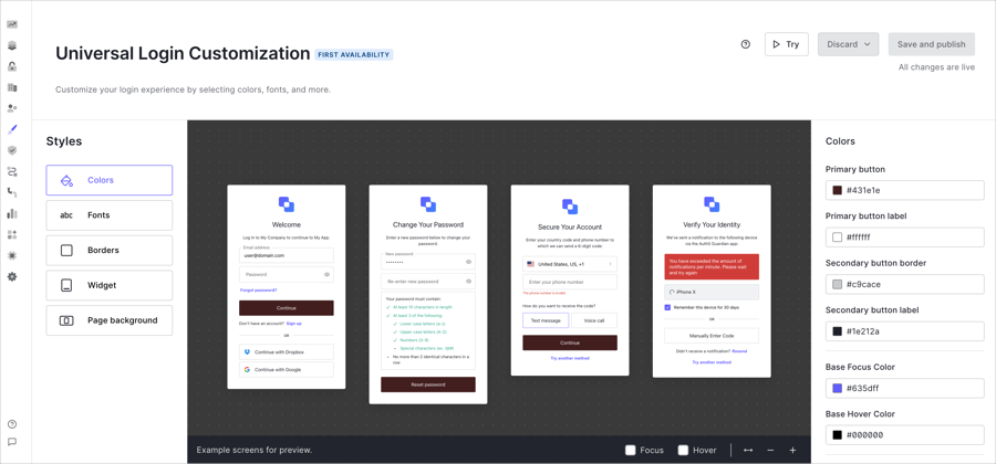
1. On the Auth0 Dashboard, navigate to [Branding > Universal Login > Customization Options](https://manage.auth0.com/#/universal-login/customizations/colors).
2. Select a [theme component](#theme-components) (e.g., Colors) from the Styles menu. Then, customize the options listed to the right.
3. After customizing your theme, select **Save and Publish**.

After you save your theme, you can access a live preview of your login experience to review and test your screens. To launch the preview in a new tab, select **Try** above the no-code editor.

<Frame>
  <img src="https://mintcdn.com/docs-staging-quickstart-revamp/3jbELjzzcIN-z8n3/images/cdy7uua7fh8z/01nmAYzRb5U8xOpUWEClH9/de60b97b42c6de04bea69914d36e6984/branding-customize-NUL-Nocode-fullscreen0.png?fit=max&auto=format&n=3jbELjzzcIN-z8n3&q=85&s=3798e7878bd81830874ede3562fa6f80" alt="" width="900" height="420" data-path="images/cdy7uua7fh8z/01nmAYzRb5U8xOpUWEClH9/de60b97b42c6de04bea69914d36e6984/branding-customize-NUL-Nocode-fullscreen0.png" />
</Frame>

### Theme components

To create your desired Universal Login theme, the Styles menu contains the following components:
<AccordionGroup>
  <Accordion title="Color">
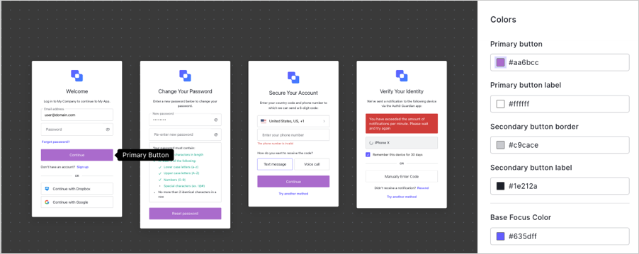
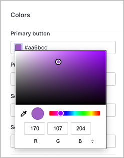
    Select an input field to change the color of the element. To choose specific colors, you can:

    * Use the color picker.
    * Input the Hex code or RGB value.
    * Select the eyedropper tool to choose a color from your screen for the available elements.

    <Frame>
      <img src="https://mintcdn.com/docs-staging-quickstart-revamp/TYcLtS8UbiQUCV_p/images/cdy7uua7fh8z/4a2iEFD4dPvxHHFueQ7rnD/ce09850794e10176aa489aaff03e67b8/2022-05-12_11-24-33.png?fit=max&auto=format&n=TYcLtS8UbiQUCV_p&q=85&s=0640823dd291d1de8e0e8287dc6414a9" alt="" width="247" height="315" data-path="images/cdy7uua7fh8z/4a2iEFD4dPvxHHFueQ7rnD/ce09850794e10176aa489aaff03e67b8/2022-05-12_11-24-33.png" />
    </Frame>

    <table class="table">
      <thead>
        <tr>
          <th>Element</th>
          <th>Description</th>
        </tr>
      </thead>

      <tbody>
        <tr>
          <td>Primary button</td>
          <td>Fills primary button, or button that triggers the next action, with color choice.</td>
        </tr>

        <tr>
          <td>Primary button label</td>
          <td>Changes color of text within primary button.</td>
        </tr>

        <tr>
          <td>Secondary button border</td>
          <td>Changes border on input fields.</td>
        </tr>

        <tr>
          <td>Secondary button label</td>
          <td>Changes text within clickable secondary fields.</td>
        </tr>

        <tr>
          <td>Links and focused components</td>
          <td>Changes text color of links that lead users to trigger another workflow, such as reset password or try another authentication method.</td>
        </tr>

        <tr>
          <td>Base focus color</td>
          <td>Changes the color of buttons when the mouse hovers over the button before selection.</td>
        </tr>

        <tr>
          <td>Base hover color</td>
          <td>Changes the color of a button when user clicks on it.</td>
        </tr>

        <tr>
          <td>Header</td>
          <td>Changes the text color of the title in the header.</td>
        </tr>

        <tr>
          <td>Body text</td>
          <td>Changes the text color of body text.</td>
        </tr>

        <tr>
          <td>Widget background</td>
          <td>Changes the background color of widgets.</td>
        </tr>

        <tr>
          <td>Widget border</td>
          <td>Changes the border color of the widgets.</td>
        </tr>

        <tr>
          <td>Input labels and placeholders</td>
          <td>Changes the text of input field labels and placeholder text.</td>
        </tr>

        <tr>
          <td>Input filled text</td>
          <td>Changes text color users type in input fields. For example, username and password fields.</td>
        </tr>

        <tr>
          <td>Input border</td>
          <td>Changes border color of input fields.</td>
        </tr>

        <tr>
          <td>Input background</td>
          <td>Changes background color of input fields.</td>
        </tr>

        <tr>
          <td>Icons</td>
          <td>Changes color of icons inside input fields.</td>
        </tr>

        <tr>
          <td>Error</td>
          <td>Changes color of error messages within widgets.</td>
        </tr>

        <tr>
          <td>Success</td>
          <td>Changes color of success message within widgets.</td>
        </tr>
      </tbody>
    </table>

    Once you make a change, the preview window displays several examples of the widgets with your specified changes.

    <Frame>
      <img src="https://mintcdn.com/docs-staging-quickstart-revamp/R8rXfTj95YBIEuC2/images/cdy7uua7fh8z/4BLBu39lD1SLi7lbjwpf5n/655a46aa8fed8415e7eb4595c09a1ea8/2022-05-12_11-23-39.png?fit=max&auto=format&n=R8rXfTj95YBIEuC2&q=85&s=7ca70846e19813dd251b249eb20d0afb" alt="" width="902" height="359" data-path="images/cdy7uua7fh8z/4BLBu39lD1SLi7lbjwpf5n/655a46aa8fed8415e7eb4595c09a1ea8/2022-05-12_11-23-39.png" />
    </Frame>
  </Accordion>

  <Accordion title="Fonts">
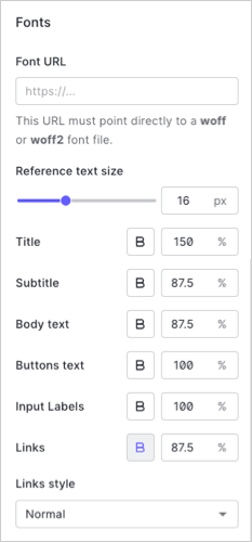
    To change the default font, enter the URL to any WOFF (Web Open Font Format) file in the input field. Your WOFF files need to be hosted using a CDN with CORS enabled or a hosting site with Access-Control-Allow-Origin header.

    Under the font URL panel, adjust the general text size under the **Reference text size** pixel option. You should note the rest of the options do not change when the reference text is changed.

    Change the following elements individually:

    * Title
    * Subtitle
    * Body Text
    * Button Text
    * Input Labels
    * Links

    When you select an option to configure, the preview pane displays the location of the element on the widget and adjusts to the specified size.

    <Frame>
      <img src="https://mintcdn.com/docs-staging-quickstart-revamp/fNPG21NgQLCA0axA/images/cdy7uua7fh8z/1dHa6nIrEGy2hGV4LyKXmE/13efef14d4725c524f76e84f06444b2b/2022-05-12_11-18-38.png?fit=max&auto=format&n=fNPG21NgQLCA0axA&q=85&s=0847137a6d4b218837b529687f506435" alt="" width="233" height="500" data-path="images/cdy7uua7fh8z/1dHa6nIrEGy2hGV4LyKXmE/13efef14d4725c524f76e84f06444b2b/2022-05-12_11-18-38.png" />
    </Frame>
  </Accordion>

  <Accordion title="Borders">
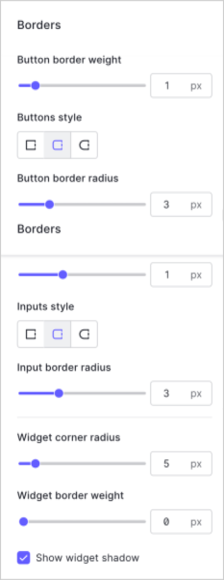
    To customize the borders, buttons styles, input fields, and widget corners adjust the slider or choose from the available options.

    <table class="table">
      <thead>
        <tr>
          <th>Option</th>
          <th>Description</th>
        </tr>
      </thead>

      <tbody>
        <tr>
          <td>Button border weight</td>
          <td>Adjusts width of border around input fields inside login prompts.</td>
        </tr>

        <tr>
          <td>Buttons style</td>
          <td>Changes shape of clickable buttons inside widgets. Available options are: sharp corners, rounded corners, or pill-shaped style.</td>
        </tr>

        <tr>
          <td>Button border radius</td>
          <td>Adjusts corners of clickable buttons when you select rounded corners.</td>
        </tr>

        <tr>
          <td>Input border weight</td>
          <td>Adjusts width of borders of input fields and clickable buttons inside login prompts.</td>
        </tr>

        <tr>
          <td>Inputs style</td>
          <td>Changes shape of input fields inside login prompts. Available options are: sharp corners, rounded corners, or pill-shaped style.</td>
        </tr>

        <tr>
          <td>Input border radius</td>
          <td>Adjusts corners of input fields when you select rounded corners.</td>
        </tr>

        <tr>
          <td>Widget corner radius</td>
          <td>Changes shape of the widget from sharp to rounded corners.</td>
        </tr>

        <tr>
          <td>Widget border weight</td>
          <td>Adjusts width of widget border.</td>
        </tr>

        <tr>
          <td>Shadow</td>
          <td>Checkbox to allow widgets to have a shadow.</td>
        </tr>
      </tbody>
    </table>

    <Frame>
      <img src="https://mintcdn.com/docs-staging-quickstart-revamp/AmyDKn5Na0kFZtbL/images/cdy7uua7fh8z/19TZeRWGWrYQWQ8ebRELXz/76ccd288acdec4ceb96d6c8402d48518/2022-05-10_13-44-25.png?fit=max&auto=format&n=AmyDKn5Na0kFZtbL&q=85&s=b81bfadff8ab98c06a629250201a3d24" alt="" width="224" height="580" data-path="images/cdy7uua7fh8z/19TZeRWGWrYQWQ8ebRELXz/76ccd288acdec4ceb96d6c8402d48518/2022-05-10_13-44-25.png" />
    </Frame>
  </Accordion>

  <Accordion title="Widget">
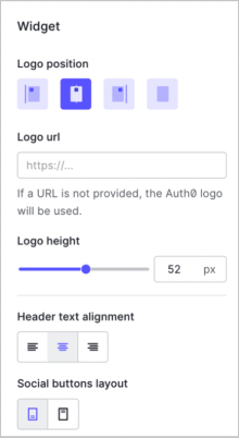
    Add the URL of your logo to configure the position, height, text alignment, and social login location.

    <table class="table">
      <thead>
        <tr>
          <th>Element</th>
          <th>Description</th>
        </tr>
      </thead>

      <tbody>
        <tr>
          <td>Logo position</td>
          <td>Choose the location of the widget to be on the left, right, or center of the page. You can also choose to hide the logo.</td>
        </tr>

        <tr>
          <td>Logo URL</td>
          <td>Enter the URL location of your custom logo. Auth0 recommends SVG files.</td>
        </tr>

        <tr>
          <td>Logo Height</td>
          <td>Adjust the size of your logo at the top of the widget.</td>
        </tr>

        <tr>
          <td>Header Text Alignment</td>
          <td>Choose if text within the header should be left, right, or center justified.</td>
        </tr>

        <tr>
          <td>Social Buttons Layout</td>
          <td>Choose if text should be at the top or bottom of the button.</td>
        </tr>
      </tbody>
    </table>

    <Frame>
      <img src="https://mintcdn.com/docs-staging-quickstart-revamp/AmyDKn5Na0kFZtbL/images/cdy7uua7fh8z/1AJksBqHefFzOmt31XlqxP/b0ac004a03681370d724b4c0d06a8351/2022-05-31_09-39-26.png?fit=max&auto=format&n=AmyDKn5Na0kFZtbL&q=85&s=88c755c9c9f300baaf965749c05f832a" alt="" width="220" height="402" data-path="images/cdy7uua7fh8z/1AJksBqHefFzOmt31XlqxP/b0ac004a03681370d724b4c0d06a8351/2022-05-31_09-39-26.png" />
    </Frame>
  </Accordion>

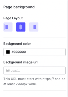
  <Accordion title="Page backgrounds">
    Add a background image URL to choose a background to display in the prompt widget. The No-Code Editor supports other image formats such as PNGs and JPEGs.

    <Callout icon="file-lines" color="#0EA5E9" iconType="regular">
      Auth0 recommends you use a JPEG image format at least 2000px wide.
    </Callout>

    Then, choose if the widget aligns center, left, or right on the screen.

    <Frame>
      <img src="https://mintcdn.com/docs-staging-quickstart-revamp/0yzvW89mU3tfXF-c/images/cdy7uua7fh8z/6WQqdGCv972KnyKMwoYeyO/61dc83d2ce507e92bde7f41df044d79b/2022-05-31_09-41-21.png?fit=max&auto=format&n=0yzvW89mU3tfXF-c&q=85&s=27df14c6f2a4f9e29bca299502d52d02" alt="" width="230" height="327" data-path="images/cdy7uua7fh8z/6WQqdGCv972KnyKMwoYeyO/61dc83d2ce507e92bde7f41df044d79b/2022-05-31_09-41-21.png" />
    </Frame>
  </Accordion>
</AccordionGroup>

## Management API

You can also customize your Universal Login theme with the [Management API](https://auth0.com/docs/api/management/v2). Specifically, you can use the Branding endpoints to:

* [Create a new branding theme](https://auth0.com/docs/api/management/v2/branding/post-branding-theme)
* [Retrieve the default branding theme](https://auth0.com/docs/api/management/v2/branding/get-default-branding-theme)
* [Retrieve a specific branding theme](https://auth0.com/docs/api/management/v2/branding/get-branding-theme)
* [Delete a branding theme](https://auth0.com/docs/api/management/v2/branding/delete-branding-theme)
* [Update the current theme](https://auth0.com/docs/api/management/v2/branding/patch-branding-theme)