> ## Documentation Index
> Fetch the complete documentation index at: https://docs-staging-quickstart-revamp.mintlify.site/llms.txt
> Use this file to discover all available pages before exploring further.

> Learn how to customize signup and login prompts for Universal Login

# Customize Signup and Login Prompts

<Card title="Before you start">
  1. Make sure your tenant has a [**Custom Domain**](/docs/customize/custom-domains) configured.
  2. Confirm you are using [**Universal Login**](/docs/authenticate/login/auth0-universal-login/universal-login-vs-classic-login/universal-experience) for all signup and login prompts, and ensure the **Customize Login Page** toggle has been disabled for Login Prompts.
  3. Check that you have a [Custom Page Template](/docs/customize/login-pages/universal-login/customize-templates#custom-sign-up-prompts) configured.
</Card>

**Customize Signup and Login Prompts** is a feature that allows customers with <Tooltip tip="Custom Domain: Third-party domain with a specialized, or vanity, name." cta="View Glossary" href="/docs/glossary?term=Custom+Domain">Custom Domain</Tooltip> and Custom Page Template enabled to add custom fields and content to their app’s signup and login prompts.

#### Use Cases

Customize Signup and Login Prompts supports two use cases: **custom content** and **data capture.**

**Custom content** is static content like text, links, or images placed directly on the signup and login prompts.

**Data capture** uses form elements dynamically added to the signup and login prompts, which is useful for collecting and validating user consent or user-produced data like surname.

Data capture is available for database connections authenticated by password . When using a <Tooltip tip="Passwordless: Form of authentication that does not rely on a password as the first factor." cta="View Glossary" href="/docs/glossary?term=passwordless">passwordless</Tooltip> connection, data capture is available when authenticating by email or SMS one-time password. Passkeys and magic links are not yet supported.

<Warning>
  Only use Signup and Login Prompt Customizations to convey or collect sensitive or regulated data as permitted under your agreement with Okta.
</Warning>

#### Terminology

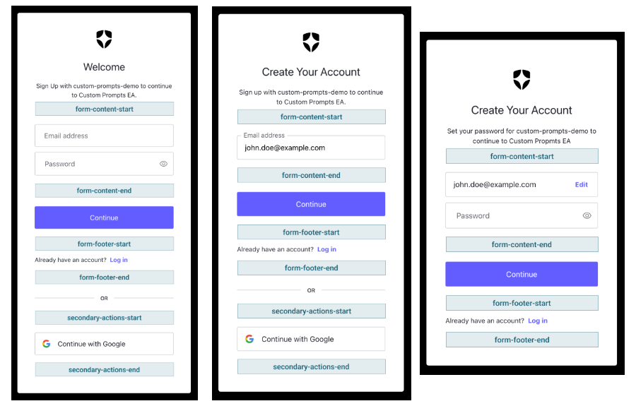
A **prompt** is a specific step in a given authentication flow. Each prompt has at least one **screen** and, depending on tenant configuration, each supported screen has either four or six **entry points,** which arelocations in the screen where custom code (**partials**) can be inserted.

The following prompts can be customized:

* `signup`
* `signup-id`
* `signup-password`
* `login`
* `login-id`
* `login-password`
* `login-passwordless`

  * `login-passwordless-sms-otp`
  * `login-passwordless-email-code`

Partials support HTML, CSS, Javascript, and [Liquid syntax](https://github.com/Shopify/liquid/wiki/Liquid-for-Designers) to power conditional logic and dynamic variables. In addition, any Liquid variable that is available to the [Page Template](/docs/customize/login-pages/universal-login/customize-templates) is also supported.

These entry points available when a database or passwordless connection is enabled:

* `form-content-start`
* `form-content-end`
* `form-footer-start`
* `form-footer-end`

The following entry points are available when at least one social or enterprise connection is enabled:

* `secondary-actions-start`
* `secondary-actions-end`

<Frame>
  <img src="https://mintcdn.com/docs-staging-quickstart-revamp/jp6vZz7DhptSlPIu/images/cdy7uua7fh8z/7sQVWVbaTp4VMW4nJjsn2G/74d0b30da7b034bd695274dbd146964b/Custom_Prompts.png?fit=max&auto=format&n=jp6vZz7DhptSlPIu&q=85&s=9f8ee2870f8605102f283de03ff0e8e1" alt="Screenshots of each Custom Prompt option and their partials" width="900" height="575" data-path="images/cdy7uua7fh8z/7sQVWVbaTp4VMW4nJjsn2G/74d0b30da7b034bd695274dbd146964b/Custom_Prompts.png" />
</Frame>

#### Use the Management API to Manage Partials

Partials can be a maximum of 10,000 characters and are managed by the [Auth0 Management API](https://auth0.com/docs/api/management/v2/prompts/put-partials) at `/v2/prompts/{prompts_name}/partials`. Every prompt must specify the `Screen` when adding, updating, or deleting a partial. Below is an example call to view all existing partials for a prompt, noting that `ulp-container` prefix is not required when referencing entry points in API calls.

```json lines
GET /api/v2/prompts/signup-id/partials
# response
# success code: 200
# not found code: 404
body: {
  "signup-id": {
    "form-content-start": "<div>HTML or Liquid</div>...",
    "form-content-end": "<div>HTML or Liquid</div>..."
  }
}
```

Partials can also be managed using Auth0 CLI’s <Tooltip tip="Universal Login: Your application redirects to Universal Login, hosted on Auth0's Authorization Server, to verify a user's identity." cta="View Glossary" href="/docs/glossary?term=Universal+Login">Universal Login</Tooltip> Customize Interface by running `auth0 ul customize` in your terminal.

<Frame>
  <img src="https://mintcdn.com/docs-staging-quickstart-revamp/cn1eMmAiJHX3hF4T/images/cdy7uua7fh8z/KxWfVAMkumyI2jrUqkEp8/b9315709899864a2f8758ad7f5a4f5b2/Partials_CLI_Image.jpg?fit=max&auto=format&n=cn1eMmAiJHX3hF4T&q=85&s=6b86d6b5a945ba1bb9923dafbfc2fa9a" alt="An image showing the command-line interface for Partials. " width="3591" height="1743" data-path="images/cdy7uua7fh8z/KxWfVAMkumyI2jrUqkEp8/b9315709899864a2f8758ad7f5a4f5b2/Partials_CLI_Image.jpg" />
</Frame>

#### Style and Validate Form Inputs

Customize Signup and Login Prompts offers pre-built styles and support for client-side validations for certain HTML form elements. The following elements are supported:

* `<input type="text">`
* `<input type="number">`
* `<input type="checkbox">`
* `<input type="password">`
* `<input type="email">`
* `<input type="tel">`
* `<input type="url">`
* `<select>`
* `<textarea>`

To use pre-built input styles, wrap your form element of choice in a `<div>` with the `ulp-field` class. Similarly, add the `ulp-error` class to the same `<div>` to use pre-built error styles. If the `ulp-error-info` element is present, a styled error message will also be displayed.

#### Client-Side Validation

The feature's client-side validation framework allows customers to validate user input using HTML attributes to execute one or more custom validation functions. Validation functions can be included directly in the Partial or included in the `<head>` of the page template.

To add client-side validation to a form element:

* Reference the validation function using the `data-ulp-validation-function` attribute on the `<div class="ulp-error-info">` element.
* Declare which DOM events the validation function should be run on using the `data-ulp-validation-event-listeners` attribute on the `<div class="ulp-error-info">` element, noting that validations run automatically on submission.
* For WCAG compliance, inputs must be programmatically linked to their error messages - for example, by using `aria-describedby="error-id"` and `aria-invalid="true"` - to ensure screen readers announce validation errors.

<AccordionGroup>
  <Accordion title="Input Field Elements: Pre-built styling for input fields">
    ```html lines
    <div class="ulp-field">
      <label for="first-name">First Name</label>
      <input type="text" name="ulp-first-name" id="first-name">
      <div class="ulp-error-info">
        First Name is Required
      </div>
    </div>
    ```
  </Accordion>

  <Accordion title="Select Elements: Pre-built styling for select fields">
    ```html lines
    <div class="ulp-field">
      <label for="preferred-language">Preferred Language</label>
      <select name="ulp-preferred-language" id="preferred-language">
        <option></option>
        <option value="english">English</option>
        <option value="french">French</option>
        <option value="spanish">Spanish</option>
      </select>
      <div class="ulp-error-info">
        Please Select a Language.
      </div>
    </div>
    ```
  </Accordion>

  <Accordion title="Text Elements: Pre-built styling for text fields">
    ```html lines
    <div class="ulp-field">
      <label for="comments">Comments</label>
      <textarea type="text" name="ulp-comments" id="comments"></textarea>
      <div class="ulp-error-info">
        Please provide an answer.
      </div>
    </div>
    ```
  </Accordion>

  <Accordion title="Checkbox Elements: Pre-built styling for checkbox fields">
    ```html lines
    <div class="ulp-field">
      <input type="checkbox" name="ulp-terms-of-service" id="terms-of-service">
      <label for="terms-of-service">
        I agree to the <a href="#">Terms of Service</a>
      </label>
      <div class="ulp-error-info">
        Please agree to the Terms of Service.
      </div>
    </div>
    ```
  </Accordion>

  <Accordion title="Phone Number Validation: Client-Side Phone Number Validation">
    ```javascript lines
    // Validation Function
    <script>
      function validatePhoneFunction(element, formSubmitted) {
        if (!formSubmitted) {
          return true;
        }
        return element.value.replace(/\D/g, '').length === 10;
      }
    </script>

    // Custom Input Field including the validation error HTML
    <div class="ulp-field">
      <label for="ulp-field-phone">Phone Number</label>
      <input type="text" name="ulp-field-phone" id="ulp-field-phone">
      <div
        class="ulp-error-info"
        data-ulp-validation-function="validatePhoneFunction"
        data-ulp-validation-event-listeners="blur,change,input,focus">
        Invalid phone number
      </div>
    </div>
    ```
  </Accordion>

  <Accordion title="Screen Reader Validation: Validation for accessible error messages">
    ```html lines
    <script>
      function requiredTextFunction(element, formSubmitted) {
        if (!formSubmitted) return true;
        return element.value.trim().length > 0;
      }
    </script>

    <div class="ulp-field">
      <label for="ulp-phone">Phone Number</label>
      <input
        type="text"
        id="ulp-phone"
        name="ulp-field-phone"
        aria-describedby="error-phone-required"
        aria-invalid="true"
        required
      >
      <div
        id="error-phone-required"
        class="ulp-error-info"
        role="alert"
        data-ulp-validation-function="requiredTextFunction"
        data-ulp-validation-event-listeners="change"
      >
        Phone number is required
      </div>
    </div>
    ```
  </Accordion>
</AccordionGroup>

<Warning>
  Be cautious when using third-party JavaScript on your signup page. Sensitive security-related information often flows through the signup page, leaving it vulnerable to cross-site scripting.

  Whenever possible, Auth0 recommends validating user-provided data before submitting.
</Warning>

#### Localize Content

Partial content can be localized by defining new custom text variables using the [Custom Text API](https://auth0.com/docs/api/management/v2/prompts/put-custom-text-by-language). Up to thirty custom text variables can be defined per screen/language combination.

##### Create or Update a Custom Text Variable

The Custom Text API is available [here](https://auth0.com/docs/api/management/v2/prompts/get-custom-text-by-language) and each variable follows a `var-<name>` naming convention. Calls to the API must specify the screen when adding, updating, or deleting a custom text variable. Markdown links are supported and are converted to HTML `<a>` elements before being displayed to users.

Below is an example call to add a variable for the text of a terms of service checkbox label in English and Spanish. See the <Tooltip tip="Management API: A product to allow customers to perform administrative tasks." cta="View Glossary" href="/docs/glossary?term=Management+API">Management API</Tooltip> to learn more.

```json lines
# PUT /api/v2/prompts/signup-id/custom-text/en
{
  "signup": {
    "var-tos": "I agree with the [Terms of Service](https://en.example.com/tos)"
  }
}

# PUT /api/v2/prompts/signup-id/custom-text/es
{
  "signup": {
    "var-tos": "Estoy de acuerdo con los [Términos de Servicio](https://es.example.com/tos)"
  }
}
```

##### Use a Custom Text Variable in a Partial

Custom text variables are referenced in partials using the `prompts.screen.text` object; the reference for the `var-tos` example in the previous section is `prompt.screen.texts.varTos`. See below for an example of how to use a previously created variable in a partial on the Signup ID Prompt, noting that the Management API's `var-tos` variable is referenced as `varTos` in the partial.

```json lines
# PUT api/v2/prompts/signup/partials
{
  "signup": {
    "form-content-end": "<div class='ulp-field'><input type='checkbox' name='ulp-terms-of-service' id='terms-of-service'><label for='terms-of-service'>{{ prompt.screen.texts.varTos }}</label></div>"
  }
}
```

#### Validate and Save Captured Data

Data captured by custom form elements is available in Actions, and Auth0 recommends that the collected data be validated.

<Warning>
  When using custom form elements, you must include the `ulp-` prefix with any input names to ensure the data can be used with Actions.
</Warning>

Each Action receives the captured data as an object on the `event.request.body`. Customers can return a validation error by using the `api.validation.error` function.

When using a database connection:

* Data from the Signup Prompts is accessible on the Pre User Registration trigger, and if a validation error is returned, the user is prevented from registering.
* Data from Login Prompts is accessible on the Post Login trigger, and if a validation error is returned, the validation error is forwarded to the customer’s application error page.

When using a Passwordless connection:

* Data from both the Signup and Login Prompts is accessible on the Post Login trigger, and if a validation error is returned, the validation error is forwarded to the customer’s application error page.

<Warning>
  Sanitize any data that you collect on the form before saving or rendering it.

  * Ensure any data being saved has passed through [Liquid’s `{{escape}}` helper function](https://shopify.github.io/liquid/filters/escape/)
  * If you render data in an Email Template, remove Liquid syntax
  * If you render data on a webpage, escape HTML entities
  * If you save data to a database, use parameterized queries
  * If you pass data into query string, encode with eg: `{{encodeURI}}` or `{{encodeURIParam}}`

  For more information regarding risk mitigation and best practices for securely storing data see [this cheatsheet](https://cheatsheetseries.owasp.org/cheatsheets/Input_Validation_Cheat_Sheet.html).
</Warning>

##### Save to User Metadata

From the Action, captured data can be sent to an external API for validation and storage or saved in `user_metadata` on the user via `api.user.setUserMetadata`.

```js lines
// Given this code in the signup form
// <div class="ulp-field">
//   <label for="full-name">Full Name</label>
//   <input type="text" name="ulp-full-name" id="full-name">
// </div>

exports.onExecutePreUserRegistration = async (event, api) => {
  const fullName = event.request.body['ulp-full-name'];
  if(!fullName) {
    api.validation.error("invalid_payload", "Missing Name");
    return;
  }

  api.user.setUserMetadata("fullName", fullName);
};
```

## Learn more

* [Use Dynamic Variables to Internationalize Custom Form Elements](/docs/customize/login-pages/universal-login/customize-signup-and-login-prompts/use-dynamic-variables-to-internationalize-custom-form-elements)
